Accessing, analyzing, and visualizing eBird Status & Trends data to plan data-driven, targeted surveys.

Introduction
The spatial distribution of a species is one the most fundamental components of its ecology. Knowledge of this distribution is critical for local and state managers to inform resource management, especially for those efforts related to species of conservation concern. Despite this importance, obtaining reliable and quantitative descriptions of species distributions can be extremely challenging, and often very expensive. Contrarily, with the rise of citizen science programs such as iNaturalist and eBird, researchers have effectively crowd-sourced the data-collection process, creating a data deluge in a field that had long been data-depirved.
Not all data is created equally, though, which has lead to rapid analytical advancements. Some examples of this would be extracting only “semistructured” survey data from a primary database, or methods to deal with overdispersion due to an abundance of assumed negative reports. Further, like other fields related to data science, machine learning methods have become increasingly popular for analyzing “big (survey) data,” as it’s often comprised of thousands – if not millions – of observations. So far, these advancements are a promising start to scaling our understanding of species distributions around the world.
The resulting information about species distributions would have the greatest influence when it is readily available to state and local mangers to inform conservation decision-making on the ground. However, this can be a difficult gap to bridge, but recent work by the eBird science team has started making this more of a reality by providing tools to access some of their data products, available to anyone. One of the most impressive tools they provide is the R package, ebirdst. This package allows users to download and analyze eBird Status & Trends data, a data product of spatial distributions and population trends currently for over 600 species in the Western Hemisphere.
The eBird science team has a great reputation of creating user-friendly and thorough documentation for their tools, such as their best practices guide for distribution modeling with eBird data, and they have continued to do so for ebirdst. However, at the time of writing, the documentation and corresponding walkthrough lack a straightforward workflow or advanced functionality to quickly explore state-level data at a finer scale.
This was brought to my attention recently when some friends at Mass Audubon’s Conservation Science Team asked for my assistance in generating a species distribution model for Eastern Meadowlark in the state. This species is in serious decline in Massachusetts, likely due to agircultural practices such as intensive mowing that are degrading and depleting their grassland habitat. For the past few years, Mass Audubon has been conducting targeted, citizen science surveys for the species. With lots of area to cover, the agency is now looking to use a data-driven process to find more meadowlarks, in order to protect their remaining breeding habitat in the state.
Luckily, eBird has already completed most of their analysis for Eastern Meadowlark, which is a great place to start for this initiative. The rest of this post is a quick-start guide to accessing this data, analyzing it at the state level, and interacting with it at a finer-scale.
Methods
Setup
First, start by downloading and installing the ebirdst package. If you are missing any of the other packages, you can also download them using this command.
install.packages("ebirdst")
We will need the following set of packages for this brief analysis. The raster package is the standard choice to work with raster data, which is simply a geo-referenced, matrix-style datatype. For accessing some additional spatial data, we will use rnaturalearth, which we can then manipulate using the sf package. The ggplot2 package (and its extensions, including viridisLite and ggpubr) provides a simple yet sophisticated plot framework within the tidyverse, along with dplyr which is used for efficient data manipulation. Finally, we will use leaflet to make a very useful interactive map, which is the biggest strength of the package.
library(ebirdst)
library(raster)
library(sf)
library(rnaturalearth)
library(leaflet)
library(ggplot2)
library(ggpubr)
library(viridisLite)
library(dplyr)
# handle namespace conflicts
extract <- raster::extract
Before jumping into the analysis, we need to make sure we have a polygon of the state we are interested in, which here is Massachusetts. There are many ways to get this polygon, but presented below is one of the most straightforward methods I have come across.
"STATE DATA"

# Get all data
us <- getData("GADM", country="USA", level=1)

# Subset to MA only
ma = us[match(toupper("Massachusetts"),toupper(us$NAME_1)),]
Now to the eBird data. Here, there’s a simple command in the ebirdst package that takes a six-letter species code of any of the species currently available. To find the six-letter species code, it’s easiest to search for the species on eBird using Explore Species and then taking the code from the URL. For example, the URL for Eastern Meadowlark is: https://ebird.org/species/easmea, and we can use that. Make sure tifs_only is set to FALSE if you want to include variable importance in your analysis. Depending on the species, the resulting file can be quite large and can take a while to download. Go get a coffee while you wait!
"GETTING EBIRD DATA"

# Download data (this takes time, ~20 mins for me)
sp_path <- ebirdst_download(species =  "easmea", tifs_only = FALSE)
Now that we have all of the data downloaded and in our R workspace, we can move on to analyzing it.
Abundance
We’ll start by extracting the abundance raster from the downloaded data, which we can do by using the aptly-named load_raster() command.
"ABUNDANCE"

# Load trimmed mean abundances
abunds <- load_raster("abundance_umean", path = sp_path)
For sake of simplicity, we will select a single week of interest, which makes the rest of the analysis more straightforward than averaging across multiple weeks. Often, especially for the breeding season, it is easy enough to assume predictions from a single week are representative of the entire breeding season, since we do not expect breeding pairs to be moving during this time. We do this regularly when birding or doing targetted breeding surveys when we assume that weeks-old observations are still relevant. In that way, essentially this is a snapshot of breeding spots.
From the stack of weekly rasters, we take the one corresponding to our selected week and crop it according to a spatial extent that approximates a bounding box around the state, using the same units as the coordinate reference system (CRS) of the ebirdst data product.
# Crop to an area rougly the size of MA
# (Week 23 = June 6-12)
abunds_23_cr =  crop(
  abunds[[23]],
  extent(c(-6.2e6, -5.6e6,  4.5e6, 4.85e6)))
This raster already has been assigned a sinusoidal projection, but the ebirdst documentation recommends converting it to the mollweide projection, which is well-behaving and aesthetically-pleasing, especially for maps of the Western Hemisphere.
# Define mollweide projection
mollweide <- "+proj=moll +lon_0=-90 +x_0=0 +y_0=0 +ellps=WGS84"
We can now reproject our raster by using one of two methods for computing the raster values under this new projection. The “bilinear” method is preferred for continuous raster data, which is what we are working with, but for categorical rasters it is best to specify the method as “ngb”, which is the nearest neighbors calculation.
# Project single layer from stack to mollweide
week23_moll <- projectRaster(
  abunds_23_cr,
  crs = mollweide, method = "bilinear")
Now we can finish up our manipulations of the abundance raster. We need to transform our state polygon to match its CRS to that of the abundance raster. This allows us to use the mask() command, which selects only the raster pixels with centroids within the polygon area. Analytically, this is not necessary, but it makes for a much cleaner and more easily interpretable representation. After cutting out the raster in this way, we can project the raster back to match its CRS to that of the original state polygon, since that CRS is extremely common and easily recognized.
# Mask to MA and crop
ma_moll = spTransform(ma, mollweide)
r = mask(week23_moll, ma_moll) %>%
  crop(., ma_moll) %>%
  projectRaster(., crs = crs(ma), method = "bilinear")
We could plot this right away using base graphics in R by simply feeding the raster to the plot() command, however, I much prefer plots that have been made using ggplot2. This requires a bit more footwork, though, since we need to convert the raster data to a regular dataframe composed of three columns: the raster value and the two dimmensions of the coordinates.
# Convert raster to data frame for ggplot
r_spdf <- as(r, "SpatialPixelsDataFrame")
r_df <- as.data.frame(r_spdf)
colnames(r_df) <- c("value", "x", "y")
Finally, we are ready to plot this data in ggplot2. This is actually fairly straightforward after all of the data-wrangling, but some key notes: 1) We use geom_raster() to plot the raster, passing the three columns to the aesthetics function, aes(), filling each pixel with the associated raster value. 2) The function, scale_fill_gradientn() allows us to use the color palette provided by ebirdst to represent the breeding season. 3) We can let ggplot2 approximate the appropriate aspect ratio using coord_quickmap() to make things a bit easier for us.
"PLOT ABUNDANCE"
ggplot() +
  geom_raster(data = r_df , aes(x = x, y = y, fill = value)) +
  scale_fill_gradientn(colors = abundance_palette(10, season = "breeding")) +
  coord_quickmap() +
  theme_bw() +
  theme(legend.position = "right") +
  labs(title = "Eastern Meadowlark",
       subtitle = "Relative Abundance, June 6-12",
       caption = "Data source: eBird Status and Trends",
       fill = "RA", y = "Latitude", x = "Longitude")
This produces the final plot of the breeding abundance raster, as shown here:
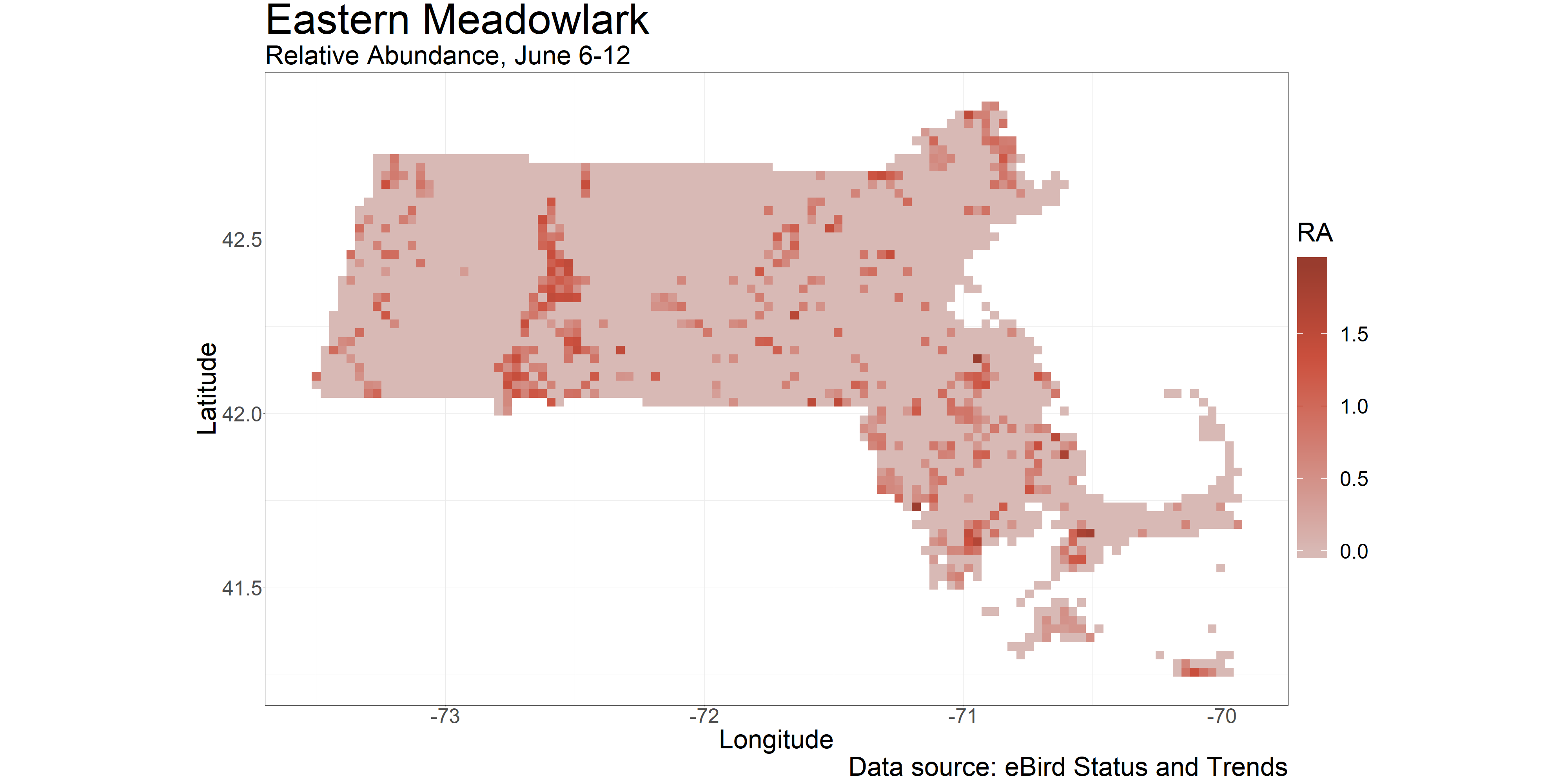
We now have a complete map of abundance for our species and state of interest. It is always good practice to take a step back and give it some critical though, to ensure it makes sense before moving forward. One of the most prominent regions of higher abundance is in western-central Massachusetts, particularly the lowlands of the Connecticut River Valley. This area is prime for grasslands (and therefore agriculture) as it is low-elevation, relatively flat overall, and complete with a constant water source. As a mental check, this makes sense, and we can even see this trend in the raw data alone. We will keep this in mind as we dig into habitat assosciations in the next section, helping us make a bit more sense of what we are seeing.
Variable importance
Quanitfying the importance of explanatory variables is a bit less straightforward when using machine learning models (as used for these maps) are opposed to classical statistical models, which is important to understand and consider the consequences of when making inferences from such data. Often, we would only be able to access this information in regard to the full model, representing the entire range of the species. Conveniently, though, the modeling framework that the eBird science team employed is nuanced and allows for localized measures of variable importance. Although I do not recall immediately the exact modeling methods, I know the original eBird STEM (‘Spatio-Temporal Exploratory Model’) methods used stixels, which are thousands of randomly-generated geometric polygons throughout the area of interest, with a model for each stixel, and a final model that drills down through all of the stixels to get an average, per-pixel estimate of the response. Methods like these that rely on localized models lend themselves to equally localized quantifications of variable importance, as we will see here. Essentially, variable importance is cached in (what appear to be) randomly-selected locations throughout the modeled region. We can then compile the data from these point locations to calculate the effective extent of the modeling area and the importance of the variables used to model that area.
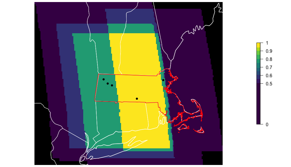
We can start by creating an ebirdst extent object, which includes a spatial extent and an associated timeframe.
"VARIABLE IMPORTANCE"

# Select region and season
lp_extent <- ebirdst_extent(
  st_as_sf(ma),
  t = c("2016-06-06", "2016-06-12")) # Models assumed 2016
The package comes with a straightforward workflow to calclulate and plot the effective extent, using the spatio-temporal extent object we generated above.
# Plot centroids and extent of analysis
par(mfrow = c(1, 1), mar = c(0, 0, 0, 6))
calc_effective_extent(sp_path, ext = lp_extent)
Now we can load all of the data-caching locations and use the plot_pis() command, which selects only those locations within the extent object and plots their data. Note: I manually modified this plotting function to improve the formatting of the figure, so yours will look slightly different.
# Load predictor importance
pis = load_pis(sp_path)

# Plot
plot_pis(pis, ext = lp_extent, by_cover_class = TRUE, n_top_pred = 15)
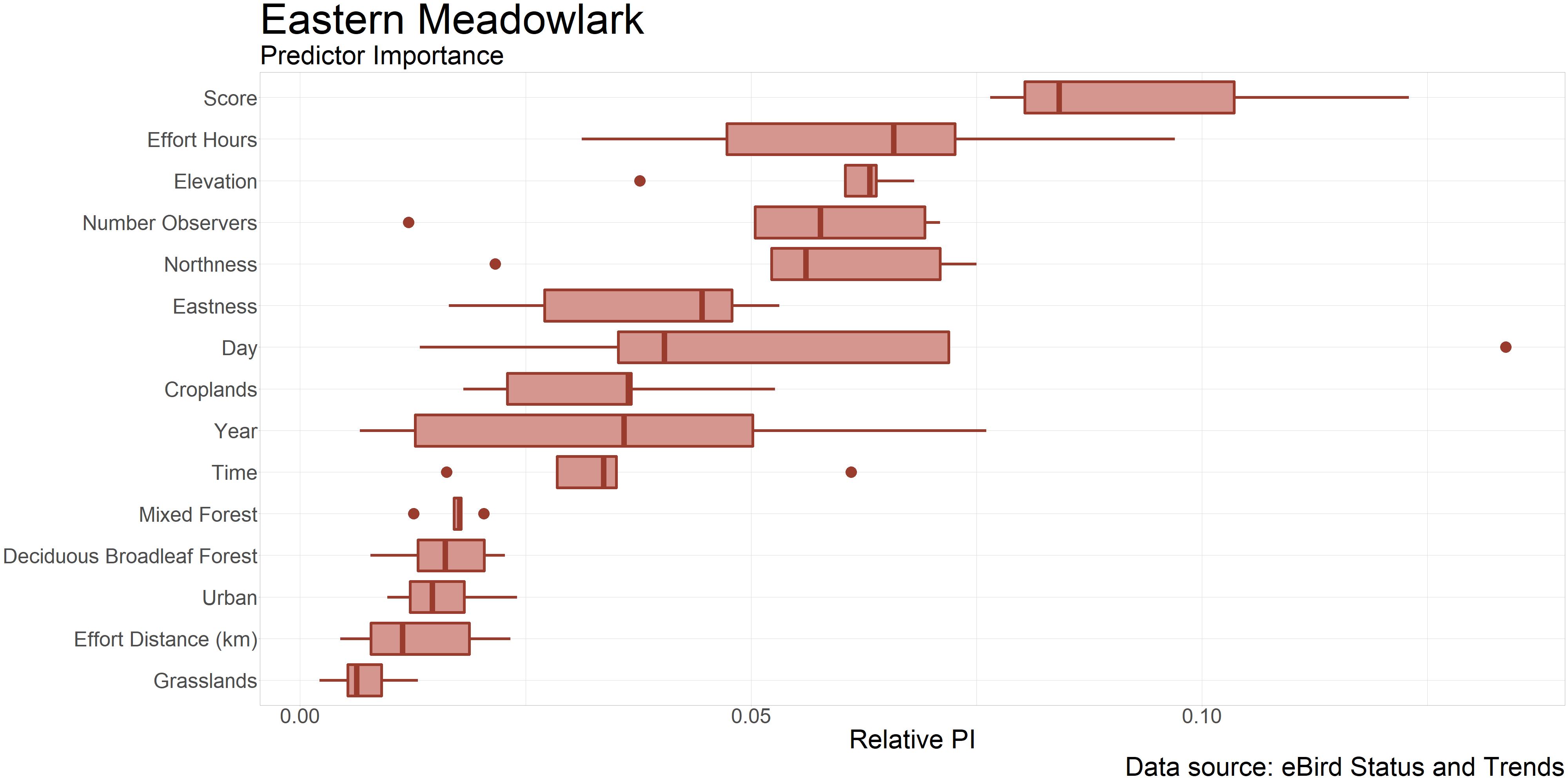
We can see here that components of the observation process – such as observer effort and observation date – are the most important in explaining observation outcomes. Interestingly, one environmental variable sticks out among that group: elevation. This makes sense given what we discussed after plotting the abundance map, regarding how flat and low elevation areas are a good place for grasslands and agriculture, which are essential for meadowlarks. In fact, we see croplands is the next most important of the remaining environmental variables, supporting our mental check and helping us understand the habitat requirements of the species. In making these inferences, it is important to remember that a high degree of variable importance also can mean that there is a strong but negative association between that variable and the response. This is likely why the forest variables are listed as the next most important – we would expect to almost never find an Eastern Meadowlark in the forest, and we are quite sure about that.
Interactive map
At this point, we have a map of general areas where we expect to find our species of interest in the state, and we have further information on what habitats it prefers, which helps us understand the species. This gives us a general sense of where we can find the species, for example, we know we should look in croplands (and also grasslands, probably, because again, variable importance for machine learning is not quite exact), especially in the Connecticut River Valley. This is useful, but there is also a lot of that habitat, and we see a considerable amount of variation in abudnance among the pixels in that region. It would be even better if we could see what the landscape looks like within each high-abundance pixel. That way, we could look for croplands or grasslands within these top pixels and schedule surveys for those exact locations.
Thanks to the awesome developers of overleaf, this is not complicated at all. First, we need to project our abundance raster to the CRS that leaflet uses by default.
# Convert to leaflet CRS
map_crs = sp::CRS("+proj=longlat +ellps=WGS84 +datum=WGS84 +no_defs")
r4map = projectRaster(r, crs = map_crs, method = "bilinear")
We can set up a couple specifics for the map, including the breeding color palette and some map attributions, which will be displayed at the bottom of the map.
# Add some specifics
pal = colorNumeric(abundance_palette(10, season = "breeding"), values(r),
                    na.color = "transparent")
map_attr = "© <a href='https://www.esri.com/en-us/home'>ESRI</a> © <a href='https://www.google.com/maps/'>Google</a> © <a href='https://ebird.org/science/status-and-trends'>eBird / Cornell Lab of Ornithology</a> © <a href='https://www.gatesdupont.com/'>Gates Dupont</a>"
Finally, we can construct the ineteractive map. The add*Tiles() commands allow us to add several basemap options, which we store in groups and specify as baseGroups in the addLayersControl(), so that we can toggle between basemaps. We can also add the abundance raster as group so it can be toggled off to see the basemap more clearly. I chose four basemaps here: 1) CartoDB.Positron has a predominantly grayscale palette, giving the raster good contrast, making it easy to differentiate pixel colors. 2) Open Street Map is a commonly-used, crowd-sourced map that stores a lot of information and could be helpful in finding the names of parks or reserves, etc. 3) Google Maps – everyone knows and loves it. 4) ESRI World Imagery is probably the most useful for us, because we can see satellite images of the landscape and look for viable croplands or other features. As for the rest of the map, we can add the raster and the legend using their correspodning, aptly-named functions. The addMouseCoordinates() function from the leafem package is extrmeley useful for organizing surveys: hovering over a location on the map will result in the coordinates being printed automatically on the top heading bar of the map.
# Map
eame_ma_lf <-leaflet() %>%
  addTiles(urlTemplate = "http://mt0.google.com/vt/lyrs=m&hl=en&x={x}&y={y}&z={z}&s=Ga",
          group  =  "Google") %>%
  addProviderTiles("CartoDB.Positron", group = "CartoDB") %>%
  addProviderTiles("OpenStreetMap", group = "Open Street Map") %>%
  addProviderTiles('Esri.WorldImagery', group = "ESRI") %>%
  addTiles(urlTemplate = "", attribution = map_attr) %>%
  addRasterImage(r, colors = pal, opacity = 0.5, group = "Eastern Meadowlark")  %>%
  addLegend(pal = pal, values = values(r),
            title = "Relative abundance") %>%
  leafem::addMouseCoordinates()  %>%
  addLayersControl(
    baseGroups = c("CartoDB", "Open Street Map", "Google", "ESRI"),
    overlayGroups = "Eastern Meadowlark",
    options = layersControlOptions(collapsed = FALSE)
  )

# View map
eame_ma_lf
As a brief aside, we can save the map as an html widget using the code below, which makes it easier to share (or host on your website!).
htmlwidgets::saveWidget(eame_ma_lf,
                        file = "eame_ma.html",
                        selfcontained = TRUE)
As described above, this interactive map is extremely useful for diving into each pixel and exploring the landscape there. Play around with it a bit, try changing the basemaps both with and without the abundance raster, and checking out the coordinates-printing feature.
Below is just one example of what we can find by checking out the map underneath the high-abundance pixels. This is a screesshot of Hanscom Airforce Base in eastern Massachusetts, a very well-known breeding location for Eastern Meadowlarks in Middlesex county. As we can see, the ebird model did a good job and predicted a relatively high abundance of the species here. I have seen meadowlarks here a few times during the breeding season; it is great to be able to personally verify this!

Conclusion
In this post, we used the ebirdst package to move quickly through the process of accessing, analyzing, and visualizing eBird’s Status and Trends data product at the state level. We learned about where we can find our species of interest in the state, and created an interactive map that makes it easy to organize future surveys to locate breeding pairs. This should be extremely helpful in finding good habitat to prioritize for protection and improve species conservation efforts.
References
-
Fink, D., T. Auer, A. Johnston, M. Strimas-Mackey, O. Robinson, S. Ligocki, B. Petersen, C. Wood, I. Davies, B. Sullivan, M. Iliff, S. Kelling (2020). eBird Status and Trends, Data Version: 2018; Released: 2020. Cornell Lab of Ornithology, Ithaca, New York. https://doi.org/10.2173/ebirdst.2018
-
Auer T, Fink D, Strimas-Mackey M (2020). ebirdst: Tools for loading, plotting, mapping and analysis of eBird Status and Trends data products. R package version 0.2.0, https://cornelllabofornithology.github.io/ebirdst/.