Introducing some tips and tricks for accessing and visualizing testing data from the COVID-19 pandemic.
Introduction
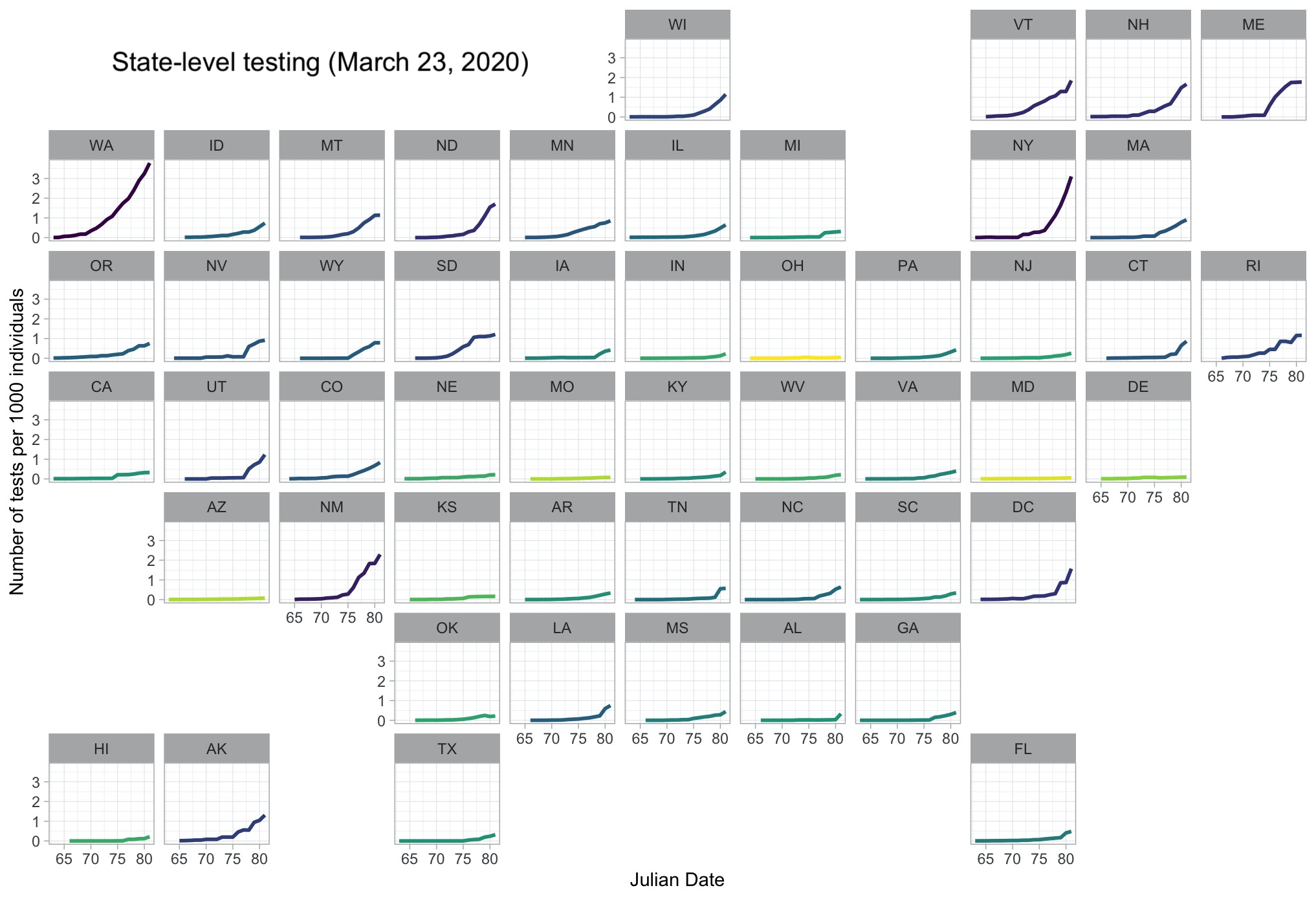
This is a quick post to introduce a few useful tips and tricks that are readily available in R to efficiently produce a state-level visualization of reported testing data for COVID-19. The end-goal here, as you can see in Figure 1, is a geo-facetted map showing dialy totals for the cumulative number of tests administered by state. To make it more intuitive, that number is scaled to the number of tests per thousand people.
Setup
First, the packages we need. As usual, we will rely on dplyr for efficient data manipulation, and ggplot2 and its extension, ggpubr, to make plotting a bit easier and more aesthetically pleasing. RCurl is a package that will help us scrape api data of US state testing from The COVID Tracking Project, which we can then compare to data of 2015 state population sizes that are readily available from the usmap package. Finally, we’ will put this all together into a nice facted plot where each facet represents a state, using the package geofacet. If you are missing any of these packages, they are all available for download from CRAN, so for example, you can use: install.packages("dplyr").
library(dplyr)
library(ggplot2)
library(ggpubr)
library(RCurl)
library(usmap)
library(geofacet)
Accessing the data
The state population data from the usmap package can be accessed using the data() command and is automatically stored under its object name, statepop. This is a dataframe of a few variables, which we will later merge with the COVID-19 data.
# State population data
data(statepop)
To access the COVID-19 API data, we will need to use the getURL() function, which initiates a connection so we can download the data using read.csv(). There are some other ways to do this using the raw JSON data, but this is the most efficient solution I’ve used.
# Get testing data from covid19 tracking
URL <- "https://covidtracking.com/api/v1/states/daily.csv"
download <- getURL(URL)
covid19 <- read.csv(text = download)
The COVID-19 data has several fields for each state on each day, including the number of positive, negative, and pending test results, as well as the total number of administered tests and number of reported COVID-19 deaths.
Basic data maniuplation
Now that we have our two primary datasets, we need to merge them into a single dataframe, which we can do using the merge.data.frame() function. This is an immensley useful function, and is essentially R’s version of Excel’s VLOOKUP() function. After that, we can make the number of tests more comparable across states by adjusting for population size. To do so, we calculate tests per capita, assuming current population sizes are similar to those from 2015. This results in a decimal that isn’t immediately recognizeable or intutive, so we multiply the value by 1000 to get the number of tests per 1000 individuals. Right now, the maximum number of tests per state is around 3 tests per 1000 individuals, yikes.
# Convert to per capita
df <- merge.data.frame(covid19, statepop, by.x = "state", by.y = "abbr")
df$perthousand <- 1000 * (df$total/df$pop_2015)
The date for the COVID-19 data is recorded in a %Y%m%d format, so today’s date would be: 20200323. To make things a bit easier for plotting, etc., we’ll just use Julian date. However, the graphic could be a bit nicer if you spent more time converting this to a more typical and recognizeable date format. We can convert to Julian date by first converting the integer date to a character string, which allows us to pass it to the as.POSIXlt() function with the specified date format so that R can recognize it as a date object. Finally, using the operator $, we can select yday to convert the date column to Julian date format.
# Convert to julian date
df$date <- as.POSIXlt(as.character(df$date), format = "%Y%m%d")$yday
At this point, we can imagine what this data would look like: each state is a facet and there is (hopefully) some exponential-ish curve showing an increase in testing. That’s great, and along the lines of what we want, but it would be a bit more readily interpretable if we color the line from each state by the total number of tests it has administered so far – done this way, states with more tests stand out together againt states with fewer test. We can do this by adding a column to our dataframe that records the maximium of the line, and since it’s a cumulative count, that maximum represents the total number of tests. We can do this super easily using the split-apply-combine framework carried out via dplyr, where we group the data by state, find and record that maximum value, and then ungroup the data back to its original form.
# Total tests
df = df %>%
  group_by(state) %>%
  mutate(overall_total = max(perthousand)) %>%
  ungroup()
Final plot
Now, we can plot our data! Some key tips and tricks in here: 1) viridis is a great and popular color palette, especially as it is colorblind-friendly, with a range from yellow to dark purple. We can implement it here using scale_color_viridis_c, where the _c at the end stands for “continuous”, as opposed to _d for “discrete.” If we’re interesed in drawing attention to the states with more testing, we’ll want those to be dark since yellow doesn’t stand out well against a white background, so we can reverse the direction of the color gradient using direction = -1. This creates a pretty stark difference among the states, though, and applying a log transformation using trans = "log" smooths out the coloring. There are a few other customizations in here, but nothing particularly noteworthy. Finally, we can use the facet_geo() function to facet the lines into their respective. states, with facets organized in a geographic manner. This results in a nice figure that’s easy to interpret even with a fairly quick glance.
# Plotting
ggplot(data = df, aes(x = date, y = perthousand)) +
  geom_line(aes(color = overall_total), size = 1) +
  scale_color_viridis_c(direction = -1, trans = "log") +
  xlab("Julian Date") +
  ylab("Number of tests per 1000 individuals") +
  facet_geo(~state) +
  theme_light() +
  theme(legend.position = "none",
        strip.text = element_text(color = "gray20"),
        panel.grid = element_line(color = "gray90",
                                  size = 0.35))
Looks good! Let’s hope these states start testing a bit faster.